The Y Membership Campaign
Client
YMCA of Metropolitan Washington
Brief
Create a cohesive set of marketing materials to promote the upcoming membership campaign
Deliverables
- Direct Mail
- Signage
- Ads
Mailer
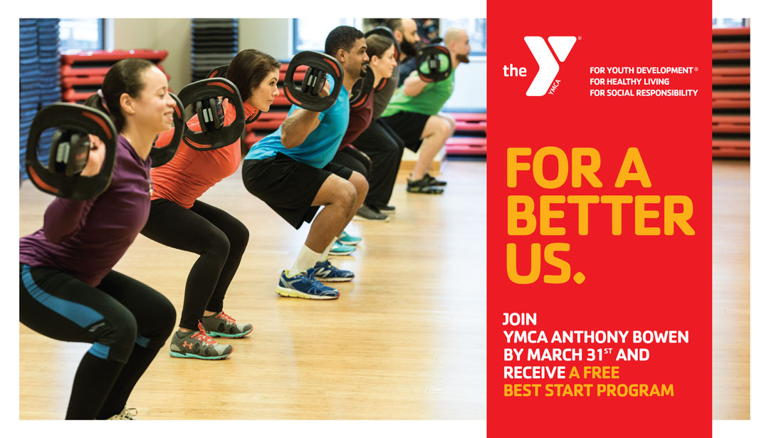
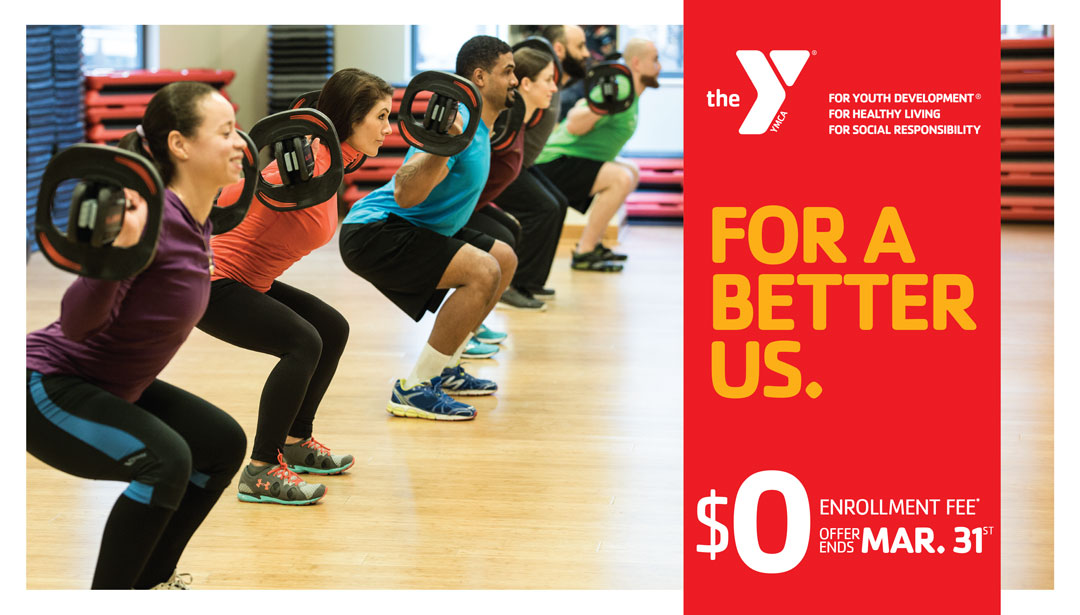
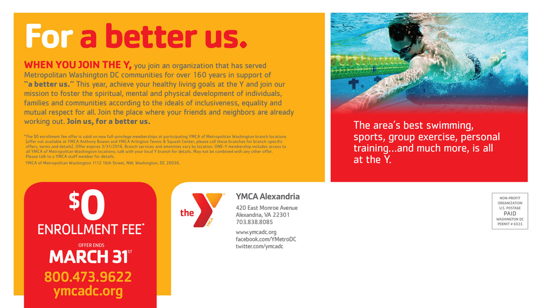
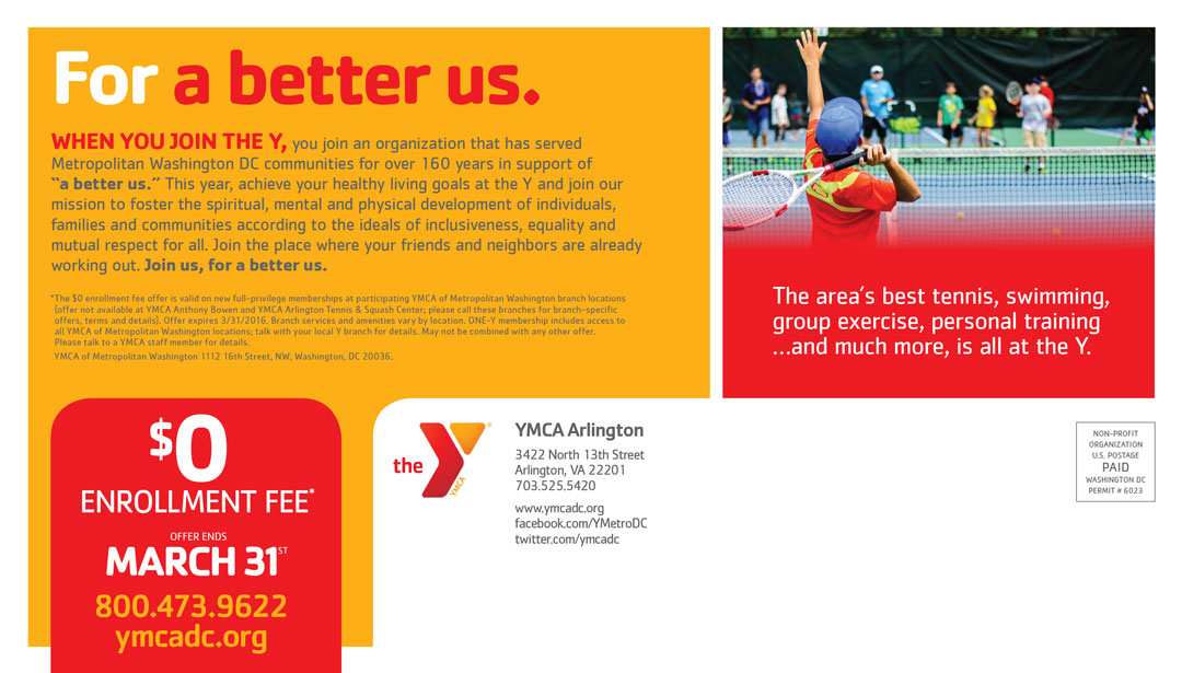
Creating a large, successful marketing campaign for multiple locations relies on many different factors. Our role in working on this campaign was creating a bold, consistent look throughout all the marketing materials based on our clients message. We’ve worked on multiple campaigns with the Y and were able to try different design concepts with each new campaign. This was a membership campaign, so the messaging and imagery were geared toward community, fitness, and living a healthy life and creating interest for new members to sign up.
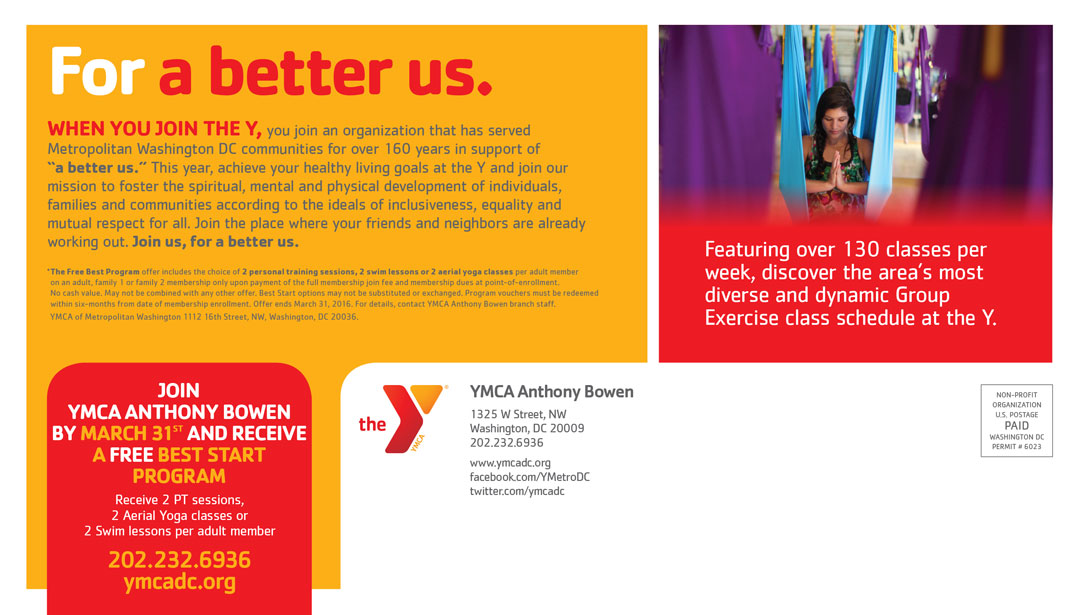
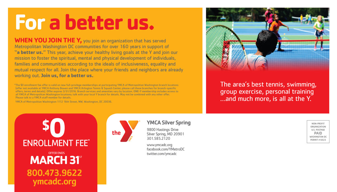
We focused on making a clean and striking design for the direct mail postcard to catch the eye instantly. The bright red from our client’s color palette makes for the perfect background color make the headline text pop. The materials created for this campaign were for six different Y branches in the area, so the imagery needed to be specifically tailored to the demographics of each branch. Hence, every direct mailer has subtle differences but carries the same design overall.
YMCA Arlington
YMCA Anthony Bowen
YMCA Silver Spring
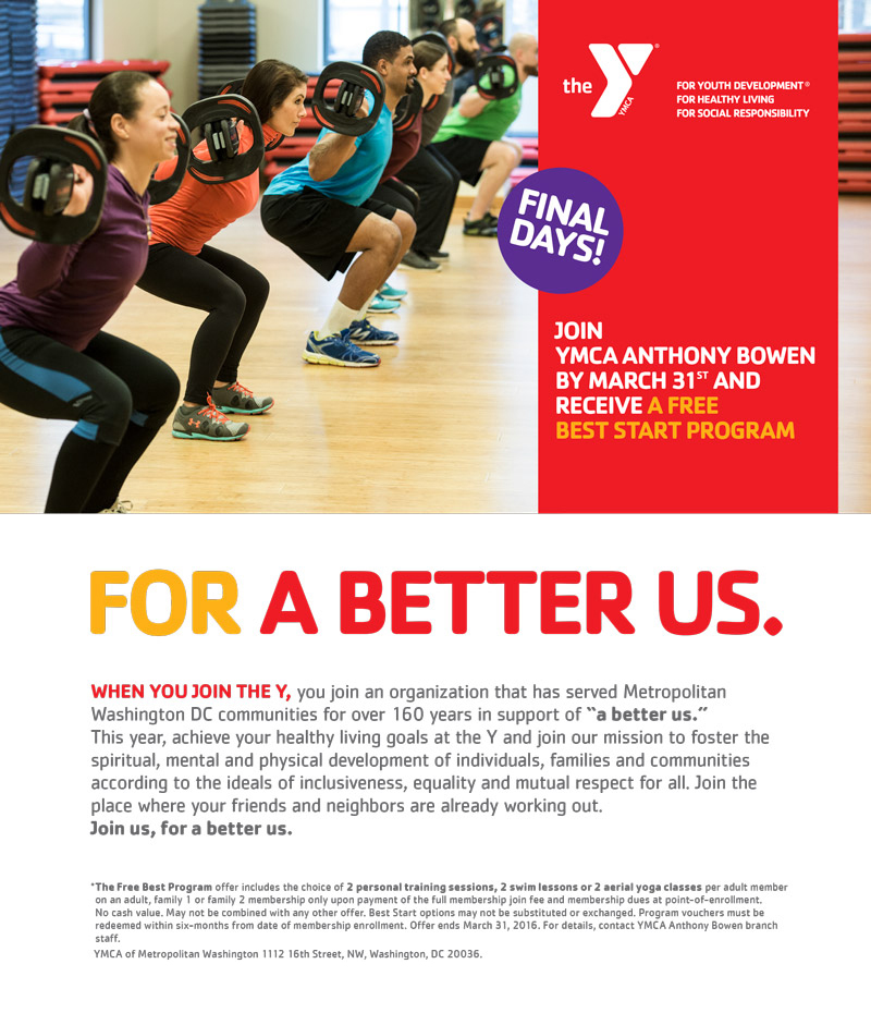
Signage & Ads
We also created outdoor signage and digital ads for the campaign. These materials needed to be simple and concise and featured minimal, yet crucial information. The signage was created for a few different areas, the largest being a 60’ x 9’ banner for a building and the smallest being a 9’ x 6’ for a fence. Like the signage, the digital ads displayed only the main message and offer due to specific size constraints. The ads were formatted for different uses based on where they were being advertised.

