HCH Internal Marketing
Client
Holy Cross Health
Brief
Refresh exisitng internal materials with a clean, modern design
Deliverables
- Color Palette (Refresh)
- Pocket Folder
- Desktop Wallpaper
- Powerpoint Template
- Word Flyer Template
- Report & Brochure Template
First Steps
Our client wanted to update their existing design materials with something that was fresh, modern, and contemporary. There was a long list of items they wanted to update, but they were able to narrow it down to what they felt was most important at the time. Those items included a pocket folder, PowerPoint template, and desktop wallpaper, to name a few.
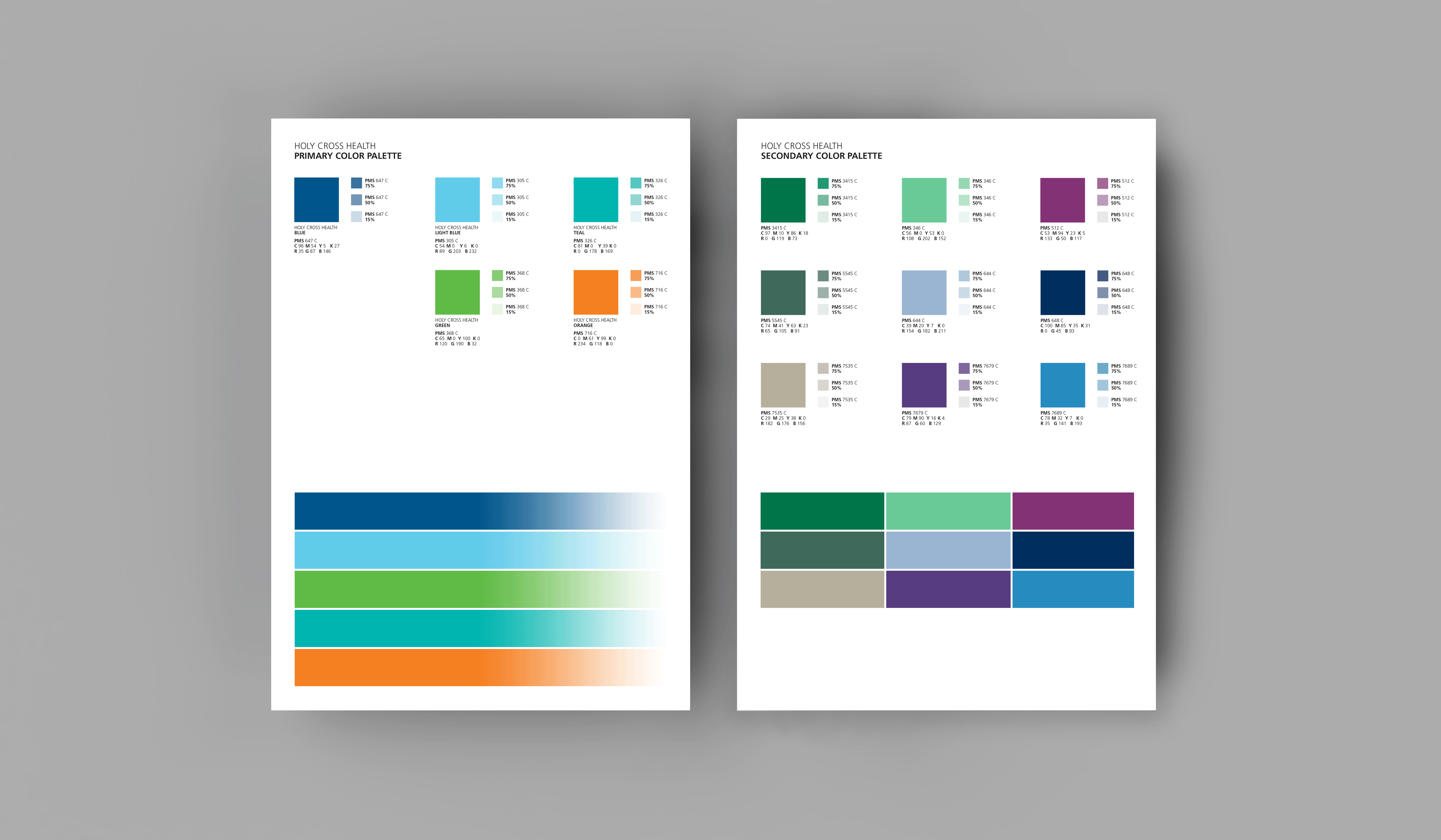
The first project we tackled was refining the large secondary color palette they were currently using. They originally had 41 colors in their full palette that were used for different entities within the company. Our goal was to reduce the number of colors in that secondary palette, but still have a variety to use across their marketing materials. The new simplified palette included 14 colors total and was separated into their five main primary colors and the nine new secondary colors we chose.
Pocket Folder
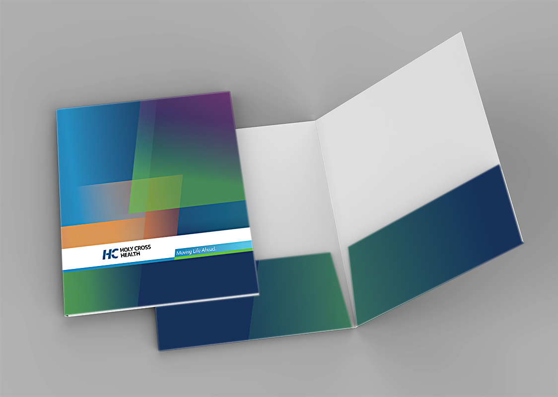
After refining the color palette, the first piece we worked on was the pocket folder. The design elements we used on the pocket folder were going to set the look and feel for all remaining materials. Our main goal was to depart from the use of the heavy, blocky design elements that dominated many of their current marketing materials. We used dark colors and angled, overlapping parallelograms based on newer design elements that had started to become incorporated in previous materials. Even with the darker colors the final product doesn’t feel heavy or weighed down. The use of different opacities amongst the shapes played a major role in keeping things modern and light.


Digital Media
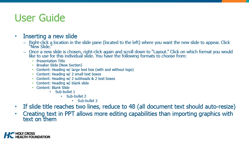
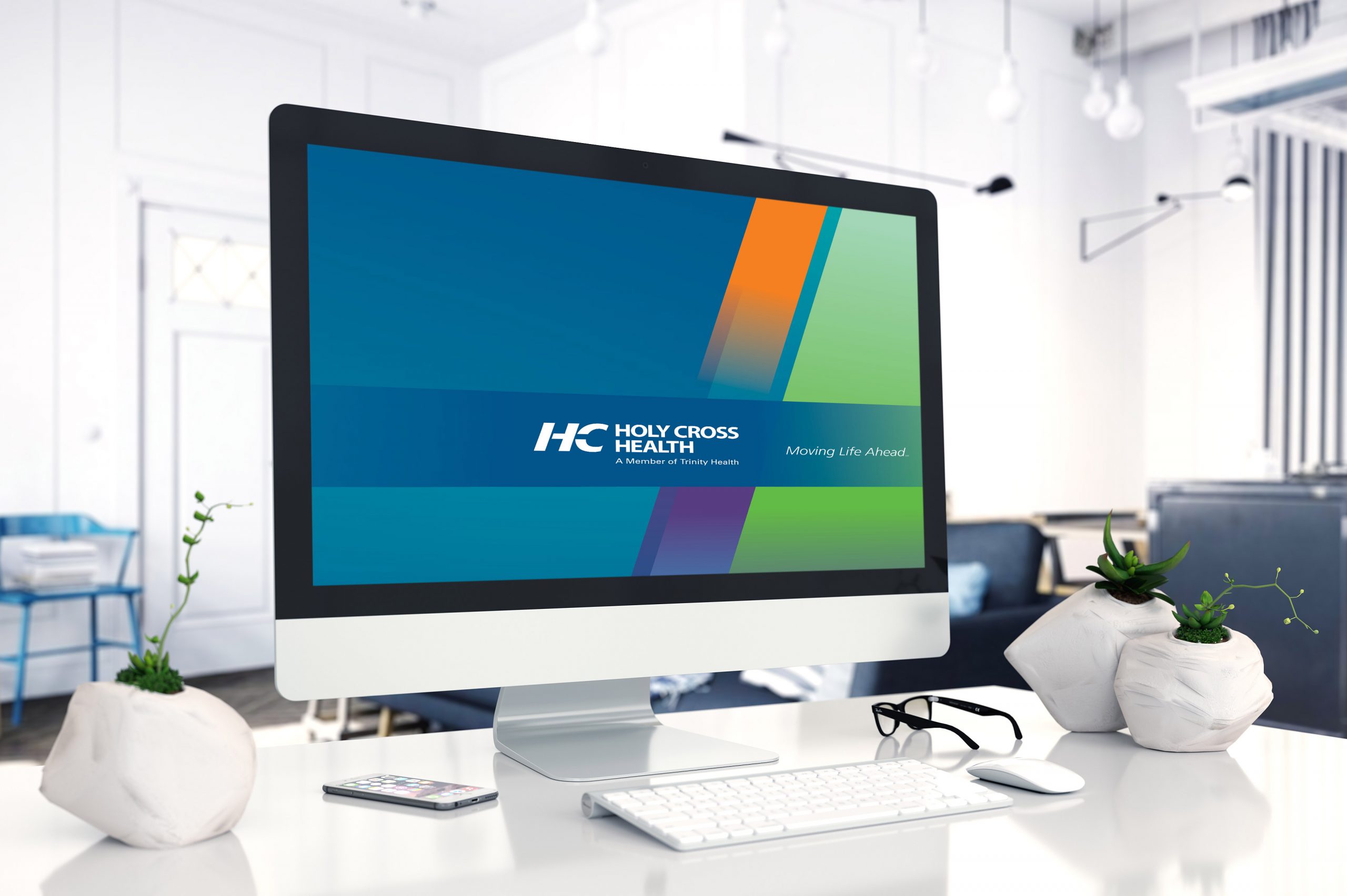
The digital materials we worked on included a desktop wallpaper and PowerPoint templates. They wanted to use design elements from another option we presented while working on the pocket folder. This worked out well because we used the same angled and transparent design elements and colors which complemented the pocket folder. We needed to keep things simple for the desktop wallpaper so we used fewer overlapping shapes and lighter colors along with their logo in the design. The same can be said for the new PowerPoint templates. There were three templates that needed to be created, one for each entity within the company. Each entity needed a standard and widescreen version, so there were a total of six templates when completed.
Print-Ready Templates
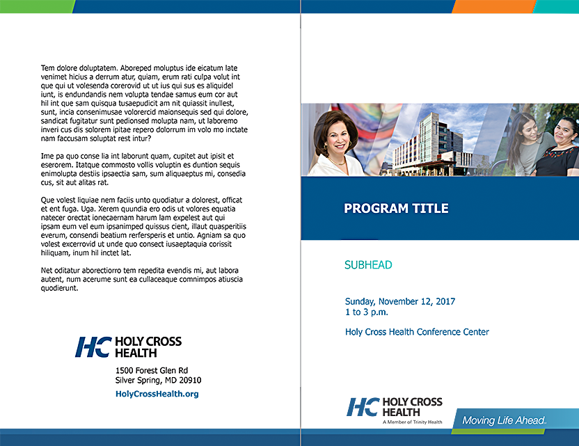
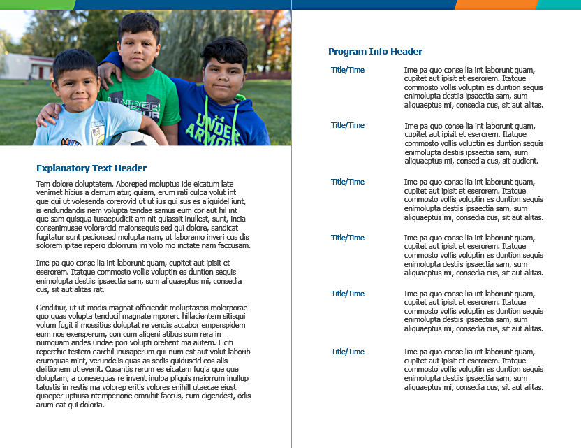
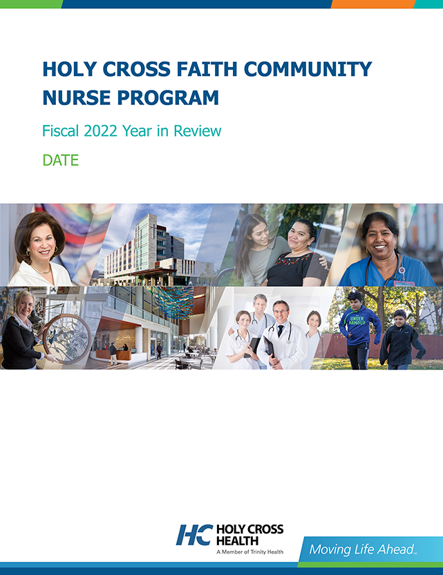
The printed pieces included templates for a report cover, brochure, and a Word flyer. Since all of these pieces were templates, made sure to designate space for text and images. Each template also needed to be neutral enough to be used for a variety of programs, information, and events.
